👋🏽 I’m Madi: User Experience Researcher (5+ years) supported by a background in data, customer engagement, quality assurance, and client relations.🔎 Currently seeking mid-senior level UX Research roles (ideally full-time and remote). Let's reach your business goals while serving the needs of your customers by tapping into my creative problem-solving and customer experience skills.
Portfolio
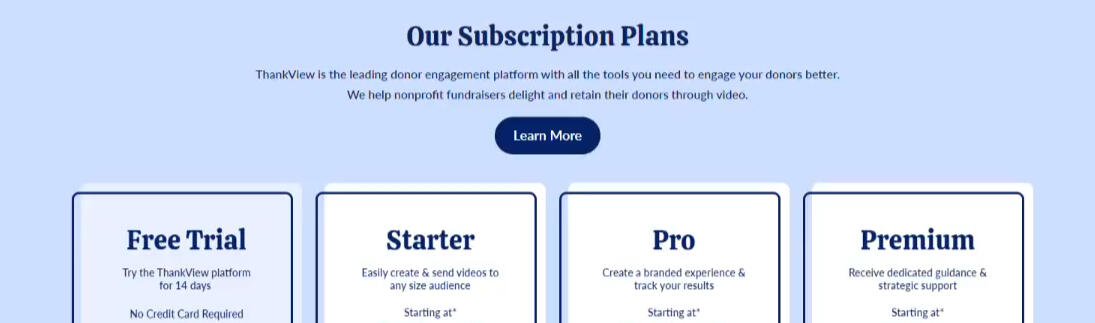
Increasing revenue through Competitive and Market Analysis

Strategizing current and future feature offerings for a Sass company to efficiently convert prospects into users quicker.
_________________________________________
Helping users reduce regret on their tattoo journey

A tattoo app concept focused on assisting the user during their tattoo journey to help reduce regret and increase confidence.
Optimizing client feedback pipelines and touchpoints
Redefining the useage of a customer satisfaction tool in order to gain more insight and feedback from active users.
_________________________________________
Saving nonprofits money via heuristic evaluations

Providing website audits for nonprofits in order to align their strategy with their website and goals.
Identifying major usability issues behind 64 pain points
Discovering and designing solutions for an internal customer relationship management app within the legal finance sector.
_________________________________________
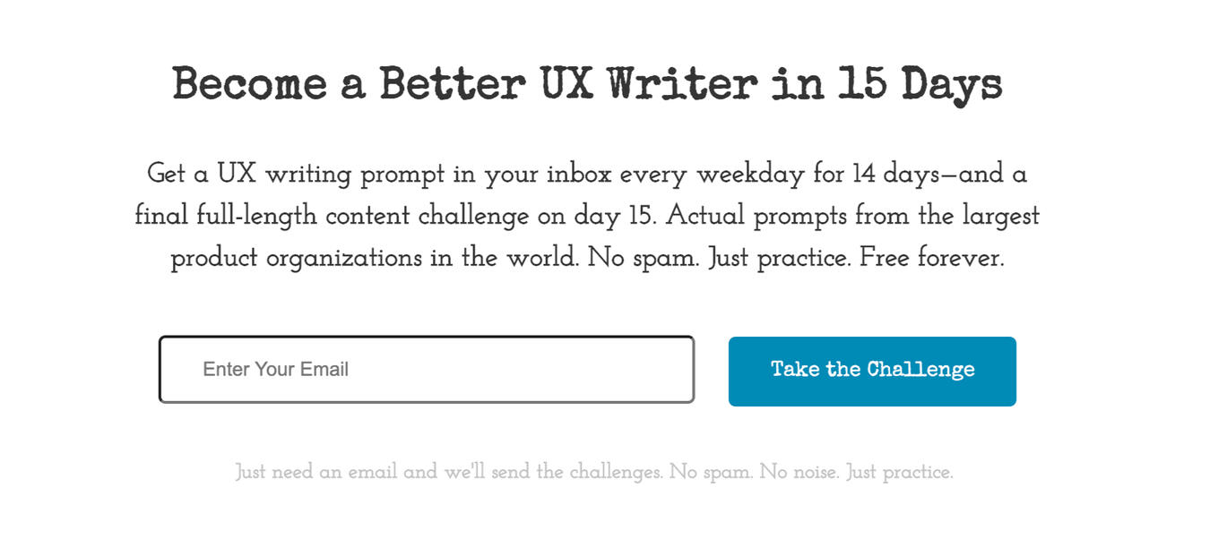
dailyuxwriting.com's Daily UX Writing Challenge

A challenge that provides prompts and character restrictions to push creativity in creating engaging copy.
Portfolio
Increasing revenue through Competitive and Market Analysis
Strategizing current and future feature offerings for a Sass company to efficiently convert prospects into users quicker.
_________________________________________
Helping users reduce regret on their tattoo journey
A tattoo app concept focused on assisting the user during their tattoo journey to help reduce regret and increase confidence.
Optimizing client feedback pipelines and touchpoints

Redefining the useage of a customer satisfaction tool in order to gain more insight and feedback from active users.
_________________________________________
Saving nonprofits money via heuristic evaluations

Providing website audits for nonprofits in order to align their strategy with their website and goals.
Identifying major usability issues behind 64 pain points

Discovering and designing solutions for an internal customer relationship management app within the legal finance sector.
_________________________________________
dailyuxwriting.com's Daily UX Writing Challenge

A challenge that provides prompts and character restrictions to push creativity in creating engaging copy.
UX Writing Challenge
How it Works:
Over the course of 15 days, Daily UX Writing Challenge provides prompts and time and character restrictions in order to push for creativity for creating engaging copy for users.Why UX Writing?:
It has been an aspect of UX I've been curious about especially with the push of technology becoming more human. I've also enjoyed writing and have done so in many ways (professional blog writing, event coverage, short stories, scriptwriting, and many more), thus wanting to expand more on it.For the curious
I did design these screens (Adobe XD, GIMP) to put them in realistic situations. But keep in mind this is about the writing, not the design.Palette color assistance from Coolors.
Even though the challenge was for 15 days, I've chosen to highlight some of the prompts.
From the website, https://dailyuxwriting.com/
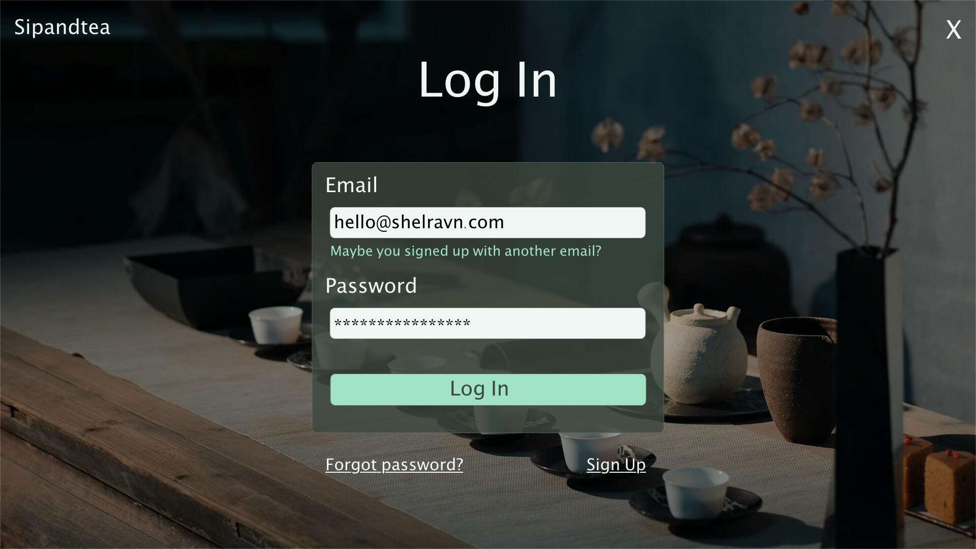
Wrong Email
Scenario: The user entered the wrong email address to sign in to their account.Challenge: Tell the user to enter the right email.
Version 1
40 characters max (33)
Maybe you signed up with another email?
Version 2
40 characters max (39)
Are you sure this email is right?

Logic: Nowadays, people have multiple email addresses. Most prompts will tell you there's an invalid character but not that a valid email was entered, and it's not the one you used to sign up for the website. So, the idea was to let the user know what they entered is right (valid email), but under the wrong conditions (not the one they signed up with)Feedback was received about error messages should be vague to deter hackers. But at what cost?
A. user knows there's a different email they used (V1)
B. don't know if the email was typed wrong or wasn't used during sign-up. (V2).If I had to choose, I'd go with V1 since it caters to users understanding the error and how to go about fixing it.
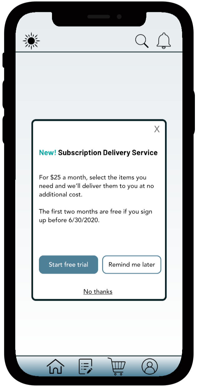
Grocery Subscription Promo
Scenario: A user is in their favorite supermarket. They open the supermarket’s app on their phone to see what’s on sale and are greeted by a promotion.Challenge: Write a promotional home screen for a subscription service that delivers groceries to the user once-a-month for a flat fee.Headline: 45 characters (34)
New! Subscription Delivery ServiceBody: 175 characters max (157)
For $25 a month, select the items you need and we’ll deliver them to you at no additional cost.The first two months are free if you sign up before 6/30/2020.Button(s): 25 characters max
Start free trial (16)
Remind me later (15)Logic: In thinking about promotions, what comes to mind is hearing a price and then what items/perks are included with the said price. It communicates the information the user wants to know and can be seen quickly. Also, being upfront about no hidden fees is important.Additionally, a service is more appealing when something is free and/or offered as a trial.
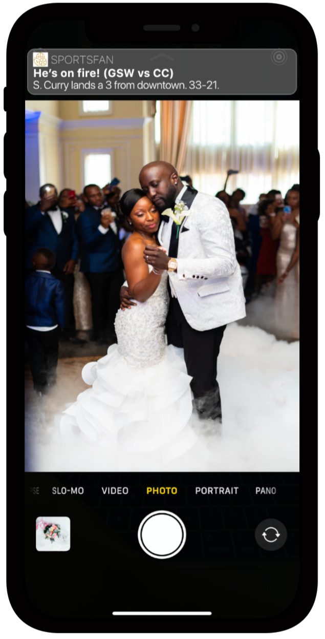
Sports App Score Notification
Scenario: A sports fan is at a wedding while their favorite team is playing against their arch-rivals. Their team scores.Challenge: How would you, quickly, let the sports fan know about the latest play, the current score, and the key players? Write it.Headline: 30 characters (25)
He’s on fire! (GSW vs CC)Body: 45 characters max (40)
S. Curry lands a 3 from downtown. 33-21.Logic: A pretty direct challenge; just putting a touch of childhood on it. Thanks, NBA Jam.
Search Results
Scenario: An elderly user is doing a Google search to find an easy way to buy contact lenses online.Challenge: Write a title and meta description for a website that sells subscription contact lenses delivered to a user every 30 days—convince them to try it.Headline: 60 characters (51)
(contactlenses.co)
CLco | Monthly Subscription Boxes for your ContactsMeta Description: 160 characters max (153)
Always be in stock by subscribing for our monthly contact delivery for $35 a month. Easy ordering, fast delivery, and no hidden fees. Cancel at any time.
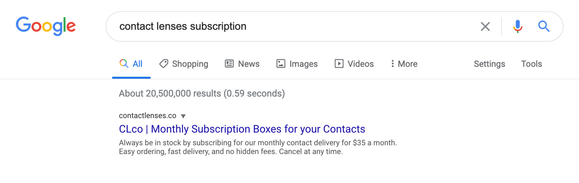
Logic: These sorts of search results need to tell the user pointed information. Definitely had to do some research on how to write meta descriptions, and I came under the character limit for this one.
Fraud Checker
Scenario: A user is creating an account. When they come to the step where they are asked to enter their name, they get an error message. A fraud detection software thinks their name is fake—but it’s wrong 5% of the time.Challenge: Write an error message that prompts them to fix the error without shaming them for having a fake-sounding name.45 characters max (55)
Just checking! Is your name spelt correctly?
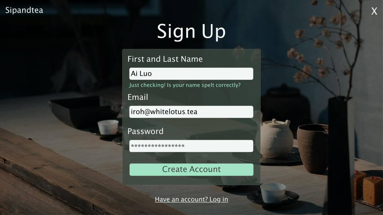
Logic: Received some feedback to put the "Just checking!" at the end. I tried that, and it sounded as if it was like a joke that offends someone, and you say, "just kidding" at that realization. So it was placed at the front to soften the blow of the system suggesting the name they entered isn't real before "excusing" the behavior.Spelled/Spelt. With some research, it's good to note that both are acceptable in the past tense of "spell".If the name Ai Lou/Iroh sounds familiar to you, hopefully, the tea confirms your suspicions. Yes, it is Iroh from Avatar: The Last Air Bender.
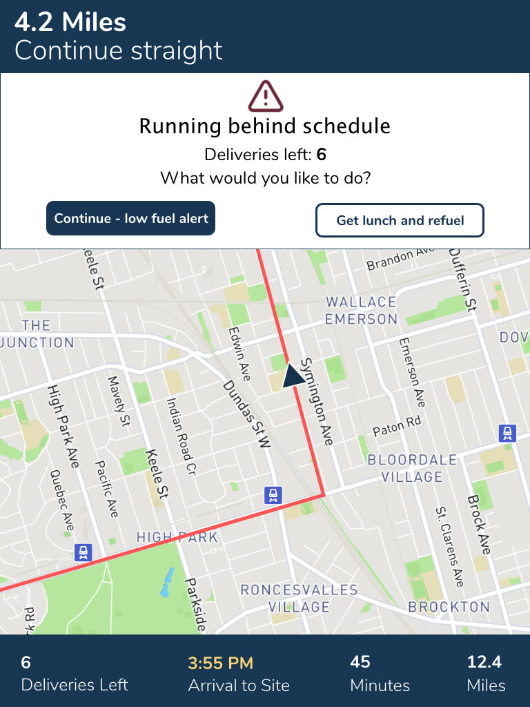
Delivery App Notification
Scenario: A short-haul truck driver has a phone app that monitors his route, schedule, fuel & deliveries.He has 6 more deliveries before stopping for fuel and lunch. Due to unexpected traffic, he’s behind schedule.He can choose to stay on his planned route for a few more stops, but risk running low on fuel and missing lunch, or he can get fuel and lunch now and finish the deliveries later.Challenge: Write a push notification alerting him of this dilemma and options.
Version 1 (Original)
Headline: 30 characters (23)
Running behind scheduleBody: 45 characters max (44)
Deliveries left: 6
What would you like to do?Button(s): 25 characters max
Continue - low fuel alert (25)
Get lunch and refuel (20)
Version 2 (Updated)
Headline: 30 characters (13)
Low fuel riskBody: 45 characters max (40)
Delay due to unexpected traffic.
You can:Button(s): 25 characters max
Reroute to Refuel Now (21)
Continue Current Delivery (25)
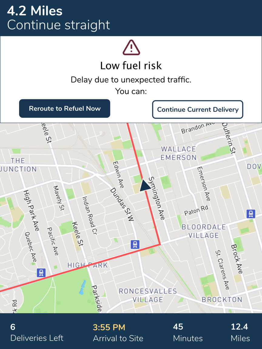
Logic: Despite previously working in the freight forwarding field and having an awareness that truckers are normally trained on how to use apps for tracking, I needed to gain some insight from fellow UX Writers (Michael J. Metts and Andy Welfle - Authors of Writing is Designing and K. Terpeza - UX Writer and Researcher).First, what information is really important, and of that information, what needs to be highlighted? This challenge, as we know, isn't about the design aspect, but this is an example where the design helped the writing.Information that's not important to highlight in the body or headline:
The fact there are six deliveries left (would be displayed elsewhere).
That he's behind schedule due to traffic (probably already knows this).
He may miss out on lunch (knows when his break time usually should be).
What is important is the program informing him that he'll eventually run low if he continues because of the unpredictable traffic. Presenting him with the option to reroute to a gas station (and possibly get something to eat) first is more human than alerting him of the problem (original) which might lead him to continue and push the risk.
Rewriting Facebook's Page Onboarding
Challenge: Using the browser on your mobile device, please go to Facebook and log in. Tap the menu icon and then tap Create New Page in the Pages section.Your Task: Rewrite the page creation and user onboarding experience. Be bold and take risks.Headline: 45 characters
Body: 100 characters max
Button: 25 characters max
Facebook's Original Onboarding Screens (7)


Rewrite of the Onboarding (5)
| Page 1 | Page 2 | Page 3 | Page 4 | Page 5 |
|---|---|---|---|---|
| Headline: (20) Your public platform Body: (84) Create a page to share your business, organization, etc. with over a billion people. | Headline: (29) What your page can do for you Body: (94) Showcase your products, raise money for causes, and promote ads for reaching target audiences. Button(s): Let’s get started (17) Learn More (10) | Headline: (35) What will be the name of your page? Body: (95) Need help? The name of your Page should be the title of your business, brand, or organization. Button(s): Next (4) | Headline: (54) What category best describes the Page you’re creating? Body: (79) Help people find your Page. This makes sure it is listed within search results. Button(s) Next (4) | Headline: (23) Initial set up complete! Body: (86) Head over to your page to add in the details like images, a website link, business hours, and more. Button(s) Go to Page (10) |


Logic: The platform's original process was 7 screens, and I was able to bring it down to 2 by highlighting the information. The whole process lacked a "Learn More" section, considering the information Facebook provided was a high-level overview.I didn't understand why the social media platform had steps for adding an image and website. While important, it is not essential for starting a page. The idea was to move this information to the end, where they could continue to customize the items for said page. Additionally, Facebook having "Done" at the bottom of the page gives a false sense that the page is finalized after these steps were completed.On the design choice of things, I couldn’t find a reason as to why Facebook's first three screens are on an automatic timer where you can't go back to read those pages once they've passed. Unless, if it was, you know, intentional.Overall, I feel the rewrite is more straightforward than the original and highlights the information in a way where it can be digested easily. The user has a clear sense of what they're doing, what they're signing up for, and after the process, what else they need to do.
Completion and Overall Thoughts
I've done writing in many other forms between scriptwriting, blog writing, book compilation, short stories, and more. The act of rewriting text so it flows and/or sounds better is a given. But when it comes to writing, I never considered character restrictions. The limits pushed me to think creatively, outside the box, and consider "How else could I say this?"Would I recommend this challenge to others interested in UX Writing? Yes! What I wouldn't suggest is posting in the Facebook group they suggest in order to gain feedback. It's essentially the blind leading the blind (everyone is new and no more experienced than you are). Submissions are not moderated, and a lot of feedback I received wasn't constructive. The feedback tended to lean more on personal opinion and there was no consideration for the environment the user would be in when using the product.To say I didn't receive any good feedback from the group would be a lie because I did. I found more value in asking UX Writers in the field for their feedback since they are more experienced, and well, do this for a living. Honestly, I gained the most insight from them and I can't thank them enough.Thank you to everyone who provided feedback (social media, LinkedIn, and the UX Writing Challenge group). I found this to be another good way to level up my writing skills, actively defend writing decisions, receive and consider constructive feedback, and grow on my UX journey.
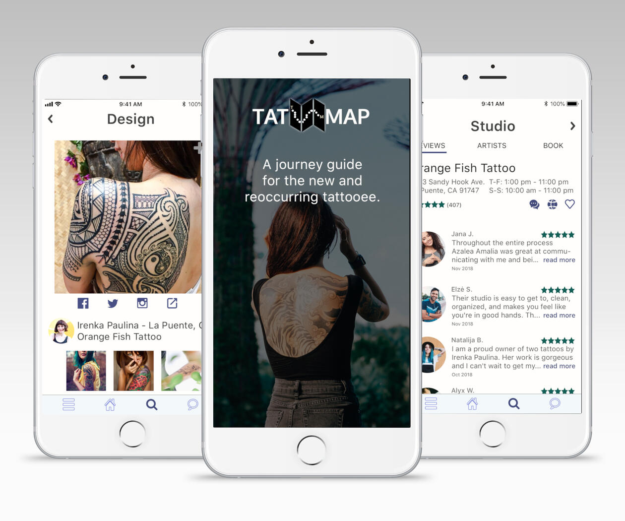
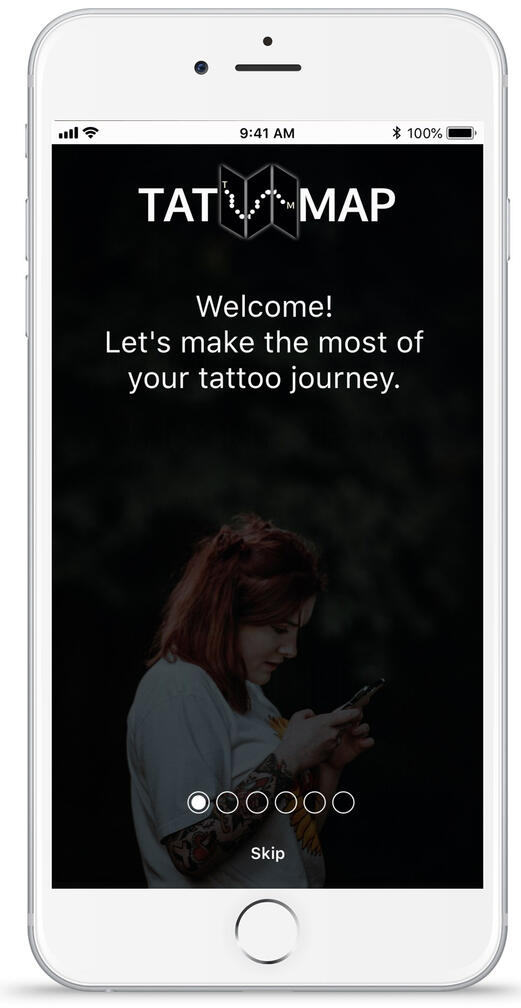
HELPING USERS REDUCE REGRET ON THEIR TATTOO JOURNEY
Objective
Tattoo apps on the market aren't helpful when it comes to helping a person start their tattoo journey, or mitigate their fears. How will they know what steps to take in making the right decisions in an area they have no information about?The goal is to create an app that guides a user through their tattoo journey.
| Problems to solve for |
|---|
| Help users reduce feelings of fear when initiating their tattoo journey. |
| Be a “one-stop shop” to give them information and the tools they need to make informed decisions and commit to getting a tattoo |
| Providing an experience that mainly supports those who do not have tattoos while including those who do. |
Research
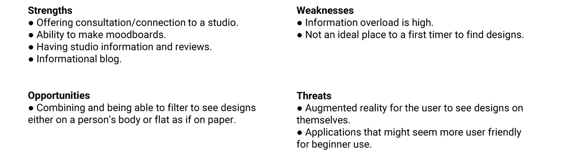
Ideation and Competitive Analysis Summary
There aren't many tattoo apps on the market.
Ink Hunter: focuses on finding a design for a tattoo
Tattoodo: immersing oneself into the world of tattoos and finding a place to get the ink done.
TatMap’s focus would be to merge and capitalize on the advantages of both competitors: bestowing knowledge of tattooing to guide a user from the beginning (finding out if getting a tattoo is right for them) to the end (getting the tattoo and leaving a review for the artist/studio) of a tattoo journey.
Ink Hunter
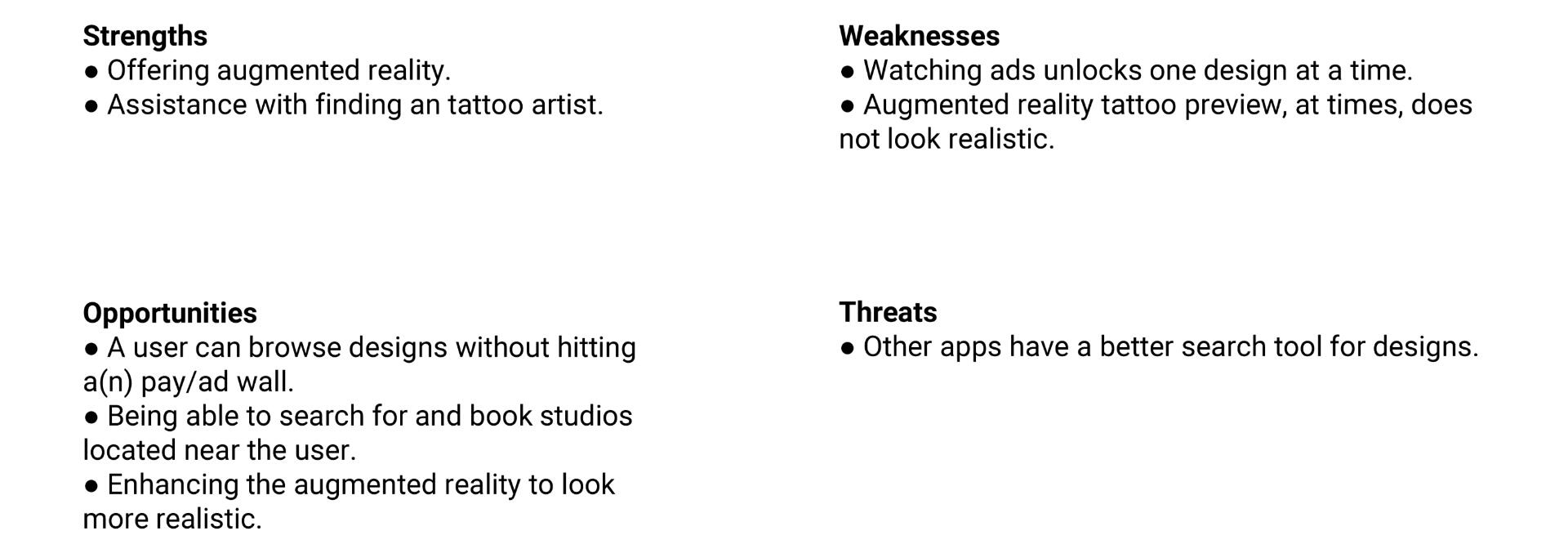
Tattoodo
Survey, User Interviews, and Results
Created a survey sent to 26 people to ask them:
How many tattoos do they have?
What type of tattoo do they have (name of a loved one, artistic design, etc.)?
[If you have a tattoo,] what was the decision for getting it (inspired, impulse decision, etc.)?
What initially held you back from getting a tattoo (worried about professionalism, scared of needles, etc.)?
What are some important app features that would help you commit to getting a tattoo (search for design, studio and/or artist information, FAQ, etc.)
Which would you prefer to see when browsing designs: a flat design or the option of augmented reality?
User Interviews with 5 people were conducted. They were asked the following depending on the criteria they met.
| If the User Has Tattoos | If the User Does Not Have Tattoos |
|---|---|
| Did you use apps to help assist with finding a design or studio? If no app, what means are used for the decision-making process? Were these helpful? Information wish they knew before getting a tattoo. What was the process of your tattoo journey from beginning to end? What methods did you use to search for a studio? What features would be helpful in an app? Would augmented reality help in the decision-making process? What type of designs do you usually search for? Rather flat design or on someone’s body? Do you believe tattoos are social? | What apps, if any, are you using to help assist with finding a design or studio? If no app, what means are used for the decision-making process? Were these helpful? What info would help you make an informed decision? How have you gone about searching for a design? Any there any concerns about getting a tattoo How have you gone about searching for a studio? What features would be helpful in an app? Would augmented reality help? What type of designs do you search for? Rather flat design or on someone’s body? Do you believe tattoos are social? |
ResultsIs there a difference in criteria when it comes to newbies vs. experienced? Not so much. Both:
Rather see a design on someone else than see static art.
Have a neutral stance on having a community feel.
Having any and all info about a studio and its artists, reviews, and a way to consult them is extremely important.
Find a FAQ meaningful, no matter if they're experienced or not.
So what can be done?
Create an app that not only first-time tattooers can use, but for repeat and experienced users as well.
Provide a way users can be guided through the process to reduce regret and feel comfortable obtaining a tattoo.
Develop an easy-to-use interface due to the wide range of people who get inked.
Personas and User Journeys
Personas and their user journeys were created via the user interviews and survey results and mapped. A total of 4 personas were created.

Ana - The Committer

Alyssa - The Tempted Scaredy Cat

Stephanie - The Risk Taker


Interacting with the images will enlarge them.
*Only 3 are shown here noting users with 0 tattoos and at least 1.
Usability Testing and Post-Test Survey
Six (6) people were invited to participate in a remote usability testing session. Tasks were given through three scenarios.The goal of the session was to assess the learnability, clarity, and navigation of the app via the prototype. Elements such as if users understand the app, how to complete basic functions such as searching for a studio and/or saving a design to a mood board, and comprehension of icons were observed.
Test Objectives
Ascertain if users can successfully complete tasks with fewer than five errors.
Determine if the layout encourages or hinders the user’s ability to navigate through the app to find what they’re looking for.
As per the results and feedback via a post-test survey:
| What it proved | What it uncovered |
|---|---|
| Users could search for a design and save it to a mood board. There was some difficulty searching for a studio and booking an appointment. Finding where current and previously booked appointments lived in the app was vague. | It was believed to be the next picture sharing social media. Users needed a home page to return to instead of using search as home. |
After the design iteration process, screens were updated and usability tested once more to gain feedback on the changes made.
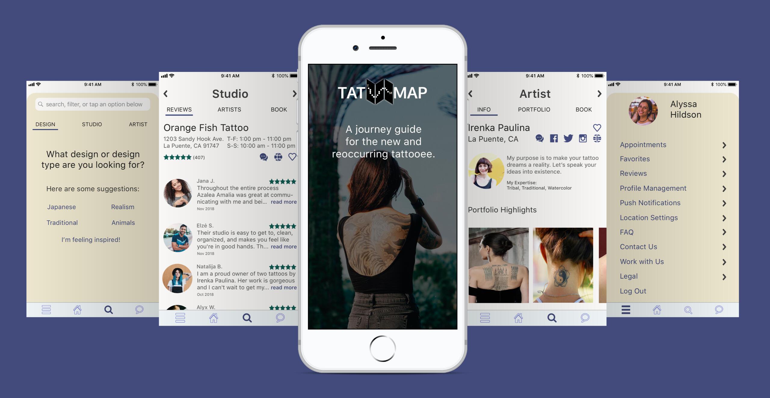
Interactive Prototype and Conclusion
How TatMap helped users reduce uncertainty and regret on their tattoo journey:
Providing experienced and newbie tattooers with a FAQ.
Guiding them with a starting point on their journey, no matter their experience with tattoos. This helped to gain their confidence as they felt they had the support they needed.
The app becomes a place where people can seek information about tattoos, search for designs, artists, and studios, create mood boards for their ideas and concepts, consult with an artist or studio, and book an appointment.
*Note: if the interaction fails to load or continually refreshes, click here for the link to inVision.
Supporting PLG through Market and Competitive Analysis
Objective and goals
A public pricing page could potentially help to weed out clients who are simply sitting through demos for pricing, which is presented at the end. If a client is unlikely to sign up due to cost alone, we want to be respectful of our time and theirs.If presenting a public pricing page is approved, what should our up, middle, and down market look like?Problems to be solved for:
| Presenting a public pricing page would: | As internal research showed...: |
|---|---|
| Reduce the number of demos Sales conducts that do not lead to sign-ups due to a potential client wanting to know pricing costs, which are slated at the end of a demo. | 70% of users who sign up for demos do not sign a contract. |
| Give potential clients the option to sign up without waiting on the Sales and Customer Success team. | 30% of contracts were not finalized due to delays in contact between the prospect and client facing teams. |
| Streamline pricing across all clients. | Various clients with the same package/features were paying different amounts due to Sales offering various discounts to get clients in the door. |
Research
If all our immediate competitors are displaying pricing, then why not us?
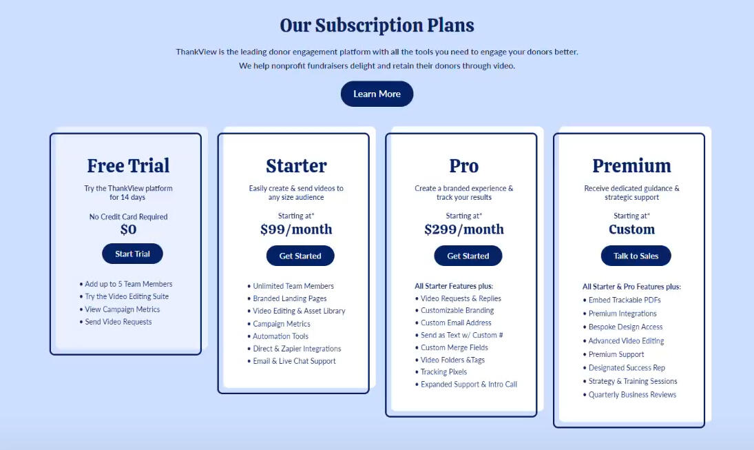
ThankView’s direct competitors displayed a public pricing page that contained the cost and features provided per package.Through market research competitor analysis, I was able to understand our competitors' platforms , gain a list of features per price point, compare ThankView’s features and offer suggestions for tiers.The report included the following:
7 competitors’ (3 major, 4 minor)’s pricing page breakdowns of features they offered in each tier
Thankview’s current “package” offerings, broken down into down (nonprofits, healthcare), middle (education), and up (higher education) markets
Potential future offerings of ThankView features to keep up with the competitors and considerations of down/middle/up markets
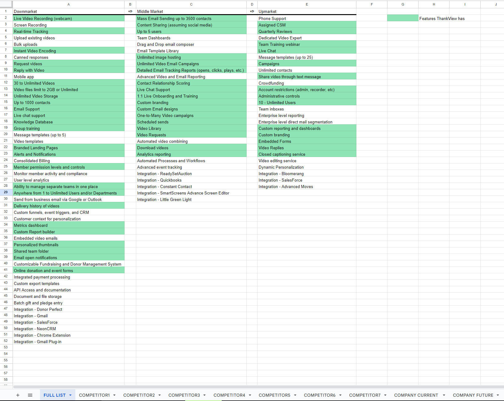
Screenshot of a combined list of competitor features based on their pricing tiers (sorted by down, middle, and up market).The green highlight is a call-out to the features ThankView was providing.
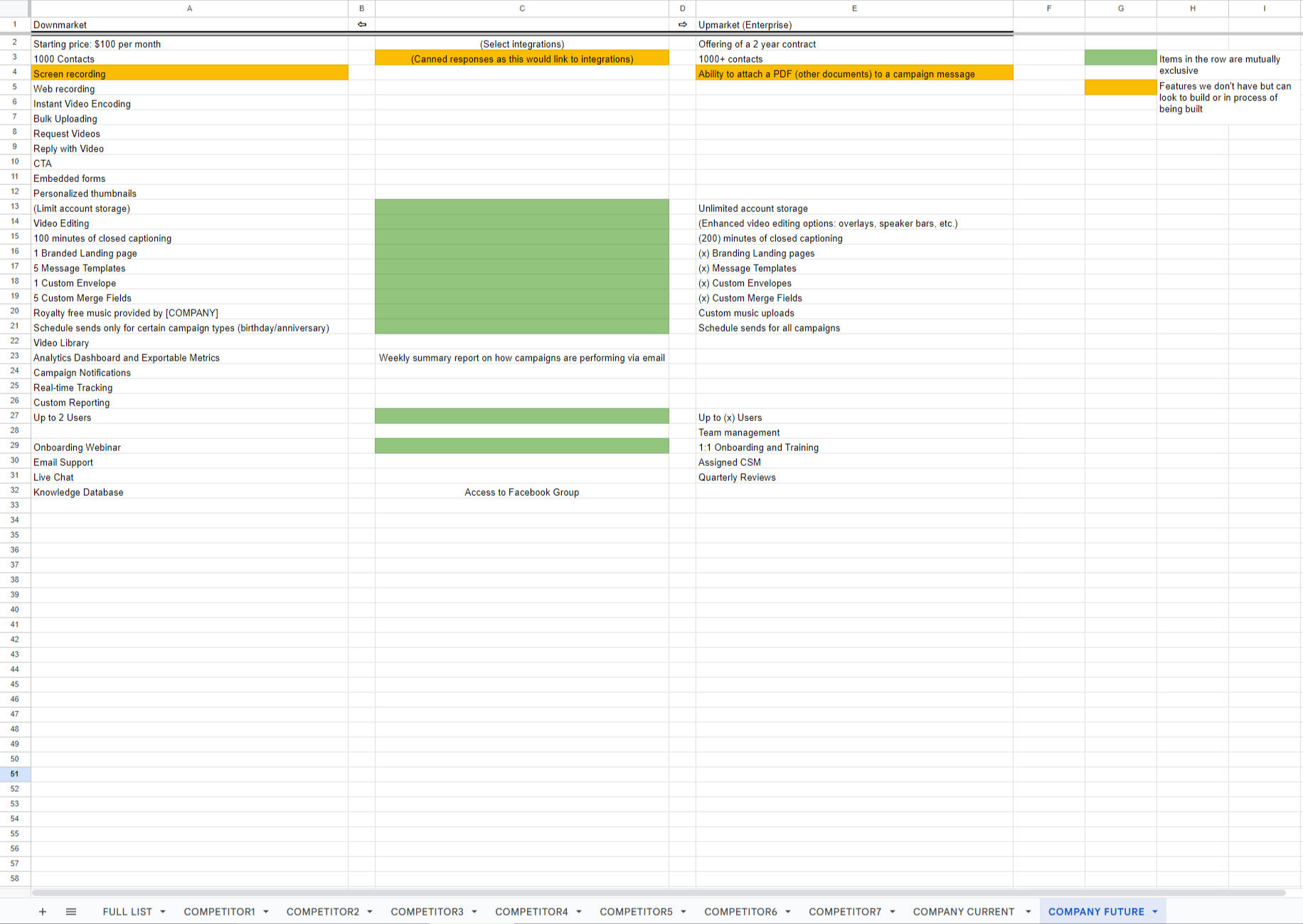
Screenshot of a recommended/potential list of feature offerings that ThankView can provide to their down, middle, and up markets.The green highlight notes a feature that would be included, but restrictive offerings across all markets.The orange highlight speaks to features ThankView did not have but could implement in the future to keep ThankView competitive with its competitors.
Conclusion
Working with members of the Product, Developer, and Sales teams, we were able to present 3 pricing tiers and a free trial. This supported the company’s goal of moving away from a sales focus towards Product Led Growth (PLG).
| Within 6+ months: | The public pricing page: |
|---|---|
| Demo requests decreased by 30% | Allowed the sales team to develop a more focused approach towards those who contact them vs. being overwhelmed by the number of demo requests |
| New accounts and activations increased by 35% | Let potential clients see the offerings for each tier, chose a package based on their company needs and goals, and setup their account without having to wait for Client/Customer Success or Sales teams to configure/validate it. |
| The public pricing page created revenue of 200K+. | This was a channel of unassisted and additional revenue for ThankView. |
| Pricing started to become more consistent. | Potential clients found what fit their needs vs. sales offering various discounts and features to get clients in the door. *It would take some time to be across the board due to the original two-year contract offerings and then convert those customers to their preferred package plan. |
Note: despite the success of the public pricing page and the continual research to support it, sometime after September 2022, it was removed in order to focus more on demo base sales.
SAVING NONPROFITS MONEY VIA HEURISTIC EVALUATIONS
Objective
Through the site, CatchaFire, I was able to provide Website Audits via heuristic evaluation to non-profit organizations by:
gaining an understanding of how users navigate their websites and keep usability heuristics by Jakob Nielsen in mind
reviewing their website's content, placement of information, accessibility, and usability
identifying if their mission is being represented properly on their site
After the heuristic evaluation, I would compile a presentation with calls outs and actionable feedback for the organization to take to improve their website.
*Sharing highlights from audits, thus not all the feedback provided to the organizations is shown below.

DCU Next Generation

"Speaking with Madi was wonderful! As an organization sometimes it's easy to get caught up in other tasks that you forget how to ask "how does this look/feel from the user's perspective?" Madi filled that void as she walked us through every page on our site and suggested both professional and personal tweaks to improve our user experience. From decluttering our sidebar to creating concise content-Madi gave us plenty of information to consider when updating our site. I was hoping to have a game plan for things we needed to improve and Madi's audit provided exactly that!"
-- Godfrey A. Jr. - Executive Director
DCU Next Generation's Mission:
Preventing generational poverty through financial literacy.
Goal as a Website Auditor:
Providing executional feedback on the organization's website. Also to provide strategic advice on creating effective/compelling landing pages


Interacting with the images will enlarge them.
Result:
The site majorly struggled with:
match between system and the real world
aesthetic and minimalist design
accessibility when it came to buttons and text.
There were old modules that are not many used on modern websites (such as columns containing RSS feeds to social media) and having content on the page that didn't match what the page was for (upcoming events only speaking of past events and an RSS feed about millennials saving money on a page about upcoming events).Overall, the mission is being projected on the site and making users interested in their cause. There's no need to overhaul the entire site, which is what the organization expected. Just tweaks and rearranging of information is all they need.
Photo Start

"Madi was great to talk to and provided actionable feedback on the same day. Couldn’t have been more pleased!"
-- David L. Esq. - Director
Photo Start's Mission:
Making a difference in the lives of children in distressed areas by teaching them life skills through photography.
Goal as a Website Auditor:
Providing executional feedback on the organization's new website. To give thoughts on the first impression which includes: how it looks, flows, performance, and uniformity.


Interacting with the images will enlarge them.
Result:
The main issue with the site was consistency and standards. The proximity of some items made it confusing to know which content related to each other.Another issue linking to consistency was having engaging content as to not lose their users. Sometimes, there were elements of storytelling, othertimes basic information about a child such as their age and where they were born.Outside of this, the website did a good job at explaining the organization's mission and make sure it expressed their mission of explaining the skills the children would learn through photography, but not turning them into future photographers.
Optimizing client feedback pipelines and touchpoints
Objective
Prior to the company merger and in an attempt to condense tools, Satismeter was chosen to be the tool used across the company. The goal was to set up Satismeter within the EverTrue platform to gain feedback for the company’s client base. This called for a revamp as many different teams were involved with Satismeter but did not communicate their needs with the Product Team, the owner of the tool.
| Problems to be solved for: | By: |
|---|---|
| Identify and understand which departments needed to be a part of Satismeter and its reporting. | Highlighting Marketing as they had an incentive program to help gain feedback from Satismeter on other platforms. |
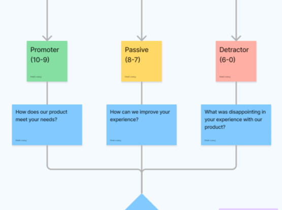
| Gaining useful and actionable feedback. | Triaging additional questions for clients to answer when their score falls into a specific ranking (Promoter, Passive, Detractor). |
| Defining who owns what part of the process. | Streamlining processes so there is no overlap or conflict with efforts. Some clients spoke of talking to someone from a different department about the feedback they left. |
Research
Internal research showed that the Product (owner), Customer Experience, and Marketing teams had different involvement with Satismeter and its Net Promoter Score (NPS).
Product provided reporting and outreach when it came to receiving feedback.
Customer Experience was reporting manually on incoming feedback to prepare for an integration push.
Marketing used the scoring labels to conduct outreach to ask and incentivize clients (majorly Promoters), to leave reviews for the product on platforms that compared ThankView and EverTrue to their competitors.
At the time, the Product and Marketing teams had their own guidelines when it came to Satismeter. Through understanding processes via departmental collaboration, a flow chart was created from the initial point of the survey being presented to a client to then determine which department would be involved depending on how they rated.
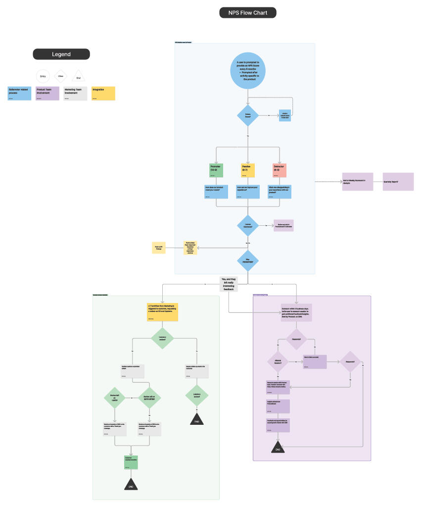
Clicking on the image will enlarge it.
Conclusion
With heavy trial and error with the Development team, we were able to insert the code effectively to start gaining feedback within the EverTrue platform.
| With its launch, the following were achieved: | By: |
|---|---|
| Defining the process for handling particular requests. | Ensuring that too many hands were not in the pot and clients were not contacted multiple times by different departments regarding their feedback. Customer Experience monitored the score to determine their client account health. Product focused on Passive and Detractor responses to develop insights and actionable feedback. Marketing zeroed in on Promoters to incentive clients to review the product on business sites (G2, Capterra). |
| Refining the feedback received. | Asking questions depending on their score helped to zero in on what a particular client's concern was and helped with developing a solution. |
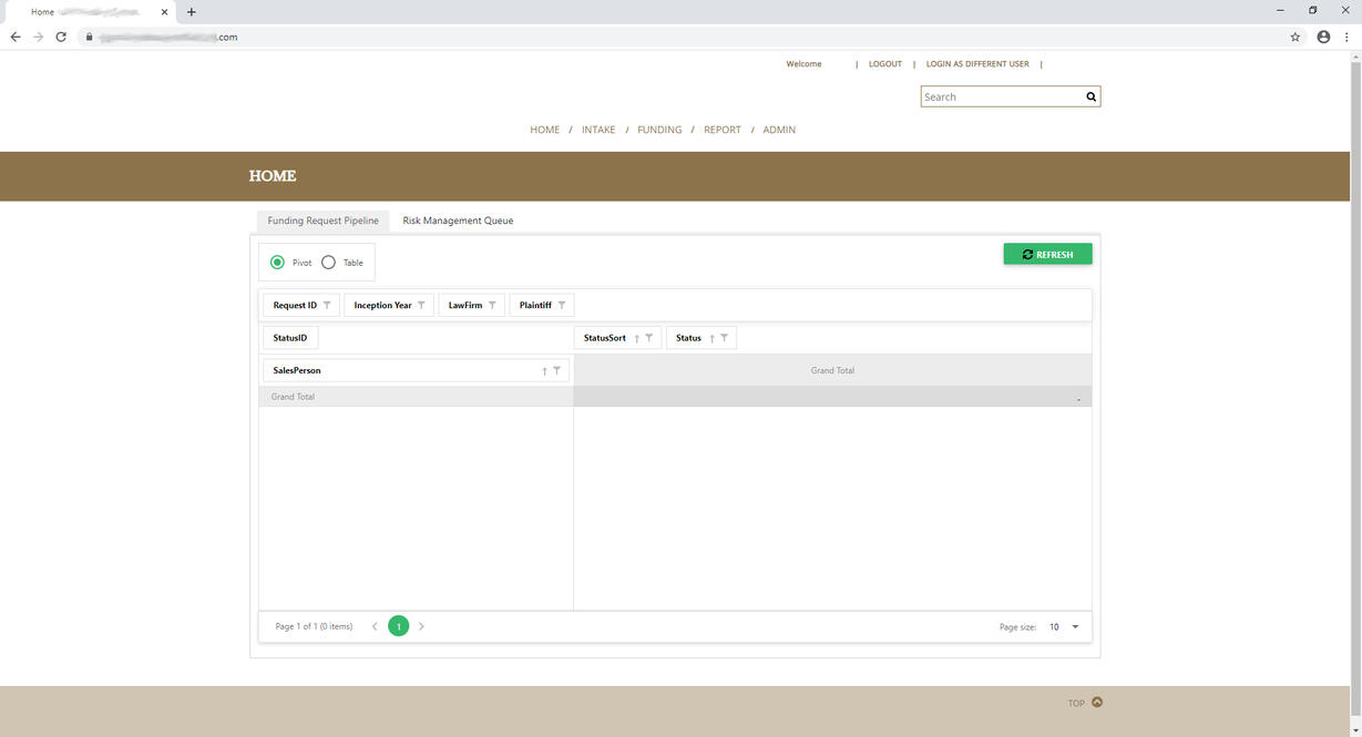
IDENTIFYING MAJOR USABILITY ISSUES BEHIND 64 PAIN POINTS
Madi is an exemplary employee who took on additional responsibilities and assisted in the building of a new in-house system. Her attention to detail, user-minded focus, and care for her fellow employees helped us build a better system for all.
-- Katie B. - VP of Compliance
Objective and Goals
Context: EP is an internal Customer Relationship Management (CRM) enterprise software application that held client information about their case. The purpose of EP 3.0 was to launch a compliance and case-tracking interface within an existing web-based CRM that handled client intake, generated contracts, and more.Objective: Identify the main pain points that currently hinder the Risk Management Department from performing efficiently and cultivate solutions for their problems.Measurable goal set by developers: Launch the new program for the Risk Management department and retire the old system.Personal KPI: At least 10% decreased time on task and 5% increase in compliance numbers. Both would result in more cases being touched and updated.Team: 1 UX Researcher (me), 1 Senior developer, 3 developers, 1 project manager, and multiple stakeholders.
| Problems to be solved for | |
|---|---|
| Understanding the workflow of the typical “Risk management” user. | Plotting the typical user journey, so it can be understood by non-Risk Management users. |
| Identify “what’s wrong” with the current system. | Allows users to pinpoint their frustrations and talk about what hinders them from effectively doing their daily tasks. |
| How can we go about fixing said issues? | “We don’t want to bring old problems into the new system.” |
Research
Journey Mapping
Collaborated with 3 leads within the Risk Management department to create journey maps to understand the workflow of multiple users of the system.In creating 10 journey maps (overview and detailed) I would be set up to understand their workflow and gain insight when they talked about the problems as I could pinpoint where in the process it was happening.
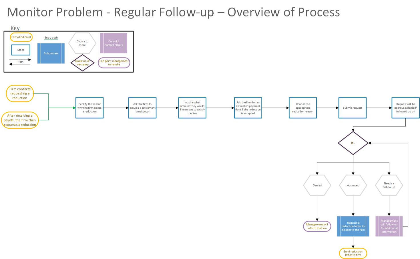
Example of the overview process of Regular Follow-up (Monitor Problem) case handling. Interact with the picture to view a larger version.Here’s a link to the detailed version of the process.
Surveying Users
I created a survey to understand the pain points and difficulties users had with the system. This uncovered:
System performance was slow.
All information about a client’s case was not in one central area.
The program was built for the Accounting department. They mainly used the search function.
The main users were the Risk Management department. The program was not built for them.
User Interviews and Ranking Severity of Issues
From the survey, user interview questions were formed to dive deeper into these issues. They were asked about their:
Day-to-day workflow in detail.
What part does the original program play in it?
Top 3 pain points and improvements.
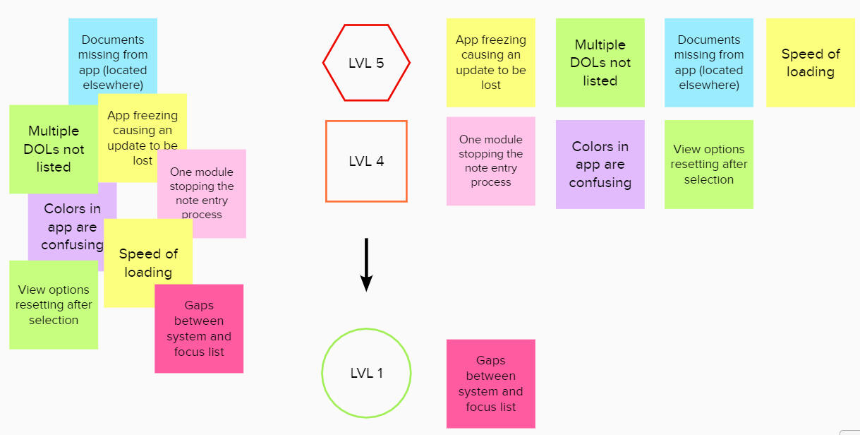
General feelings about the program they were using now.
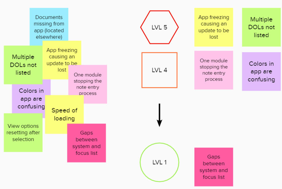
As a result, roughly 64 pain points were discovered. They were categorized via card sorting. From there, 12 recurring themes were identified, placed into 5 Categories, and the pain points were ranked by severity. Severity was defined as a range from 5 (causing high levels of frustration and ineffective use of time) to 1 (minor frustrations not greatly impacting workflow). High (5 and 4) level issues were proposed to be rectified prior to launch.A report was provided at a meeting with stakeholders, the senior developer, and the project manager. To some, a good number of the pain points discussed were eye-opening.
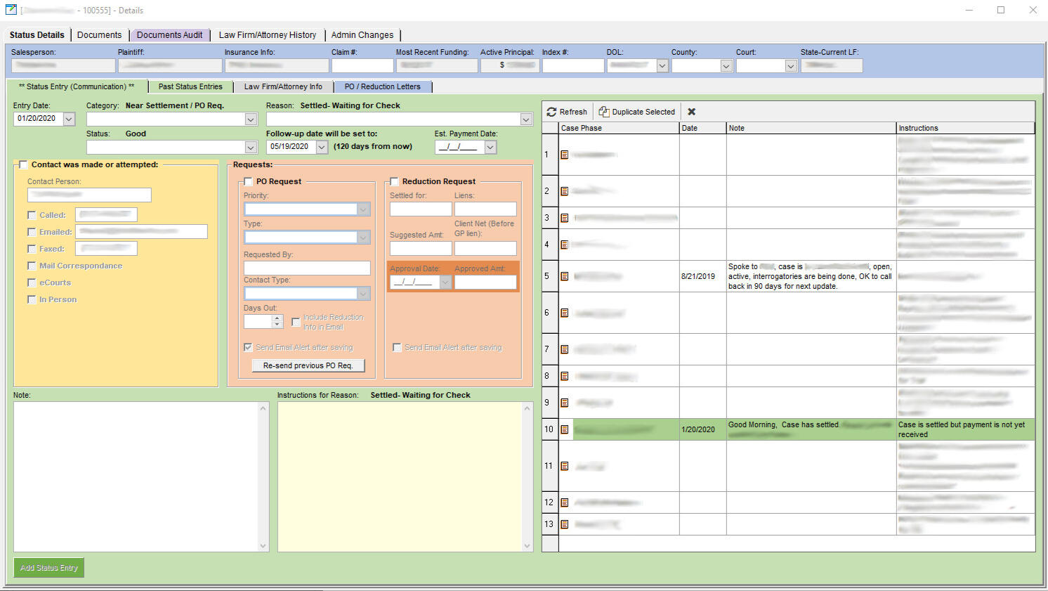
Usability Testing and Results
As the developers built out the interface, daily task work scenarios were created for usability testing. Even though the old and new programs had some similarities, it needed to be understood if users could navigate the system in a way that did not slow down their daily workflow.2 sets of usability tests were held with 6 participants each:
Day-to-day tasks (searching for clients, submitting status entries, etc.).
The functionality of the program itself (how to create a queue, set filter criteria, etc.).
As a result of both tests, most users found the new interface difficult to understand, navigate, and use the functions the developers had built. Of course, some of these items came with a learning curve, but some major aspects during user testing resulted in critical errors (over the allotted time or the user giving up in frustration) and had the user think in unconventional ways (e.g. negative integers to obtain cases that were past due [-30< for 30 days out of compliance] vs. setting a whole number to see past due cases for there is no reason for them to work on a queue with future cases that had been already updated).Despite the negatives, employees enjoyed the clean presentation of information along with the new functionality around creating and saving search filters.
Old Program
Existing Application with new Interface
Conclusion and Goals
After solutions were provided and employees were trained by me, the implementation and launch of EP 3.0 gave the Risk Management department a new home for their day-to-day processes.
| What was solved: | What was gained: |
|---|---|
| Understanding the workflow of the typical “Risk management” user. | As a user of the system, but not in the same way as my colleagues, it helped me and the developers to understand the workflow of my teammates and how building out the new system could support their day-to-day tasks. Additionally, the workflows were used as training materials for future onboarding. |
| Identify “what’s wrong” with the current system, and how can we go about fixing said issues. | 64 pain points are a lot. But grouping and breaking them down helped to tackle what can be done before launch and what should follow in upcoming updates. Users aided in their own user experience as some of their suggestions were implemented prior to launch. |
What about the measurable goals you mentioned?: The developers' goal was to get the department into the system. My measurable goal was to help reduce time on task and improve compliance numbers.In having conversations with department leads two weeks after launch, I was told the following:Compliance numbers dipped slightly and users felt it took them about the same amount of time, if not longer, to go through their workflow.This can be due to the learning curve the team has to go through to unlearn one program's functional to learn an interface that didn't quite sense to them, and some parts of the old system's functionality that were helpful in their day-to-day tasks were never implemented.So you could say launch was successful but not without growing pains.
About me
Research is critical to the design process when it comes to products or experiences for users. If you're in the business of solving problems for users and do so without research, then whose problems are attempting to be solved? The users or the company's personal ones? -- My ethos for UX Research
If research is not being conducted in any sort of capacity and initiatives are supported by confirmation biases, who is really winning here? I can give you a hint: it’s not the company or its user base.As you know by now, I’m Madi.Working in customer service in different fields lead me to UX. What do companies do with user feedback? Does it really go into an abyss? If companies listen to user feedback, how do they use the voice of the customer to problem-solve?That curiosity first brought me to UX Design and then lead me on the path of User Research. By bringing a creative sense in providing solutions while supporting them with data, I’ve been able to help companies bring in 200K+ in revenue, create viable solutions for platform-wide customer issues, develop actionable items to improve products for internal teams and clients, and more.I do a bit of out-the-box thinking, posing questions that may not have crossed anyone’s mind, and considering the what-ifs or edge cases. No one is perfect and that’s okay. But as long as people can come together while checking their biases at the door, everyone can win. It’s just that simple.
Contact
Curious about what we can achieve together? Get in touch!Email is the preferred method.You can check out my additional work and experience on LinkedIn. You can send a DM through there if that works for you.New to UX? Curious about my career transition into UX and UXR? Seeking advice on how to approach the field? You can sign up for a time to chat via Calendly.
Resume